2017-2021
Past projects
A few projects where I solved problems, designed experiences, and kept things usable.
Go ahead, scroll, explore.
American College of Veterinary Radiology
Redesigning ACVR's digital presence to bring a modern feel and elevate it as a thought leader, educating, informing, and supporting professional growth.
Contribution
I was a designer / art director — UI/UX, and visual as part of a very small team of three, defining the visual language, information architecture, and content strategy for both public and member experiences.
Challenge
ACVR’s site experience had become static, giving visitors little reason to return. It functioned mostly as a “once and done” visit rather than an ongoing resource.
As multiple contributors added content, the experience began to lose cohesion across layout and structure, with no clear path through an information-dense site. The experience needed to have structure, a modern feel, and a clear way to surface content — all within a limited budget.
Approach
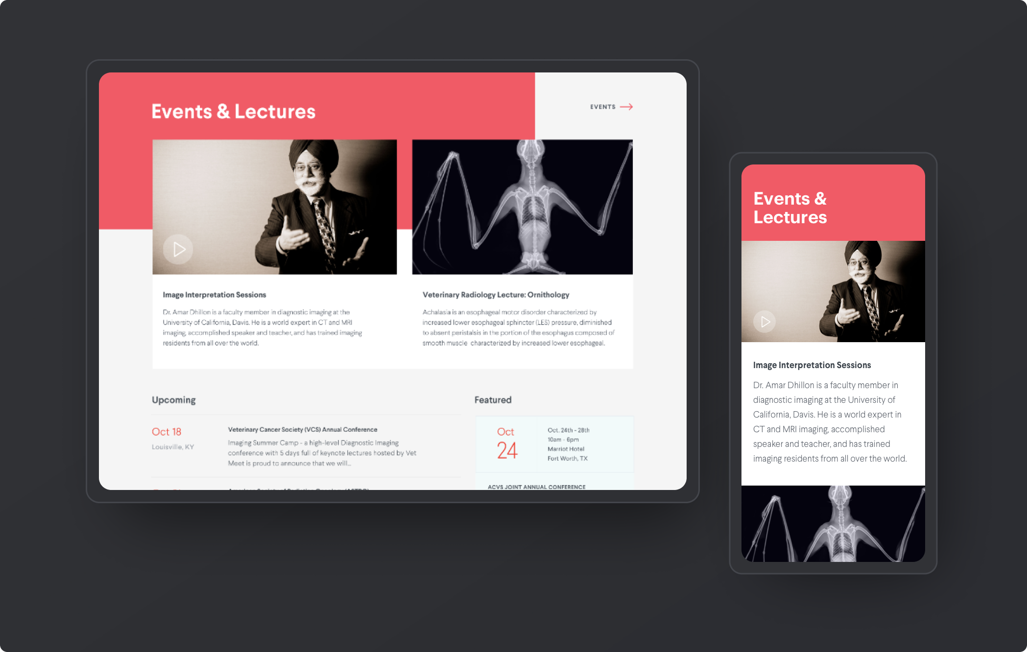
Position ACVR as a go-to resource for both members and the broader professional community. To support this, the landing experience was rethought as an active knowledge hub for veterinary radiology.
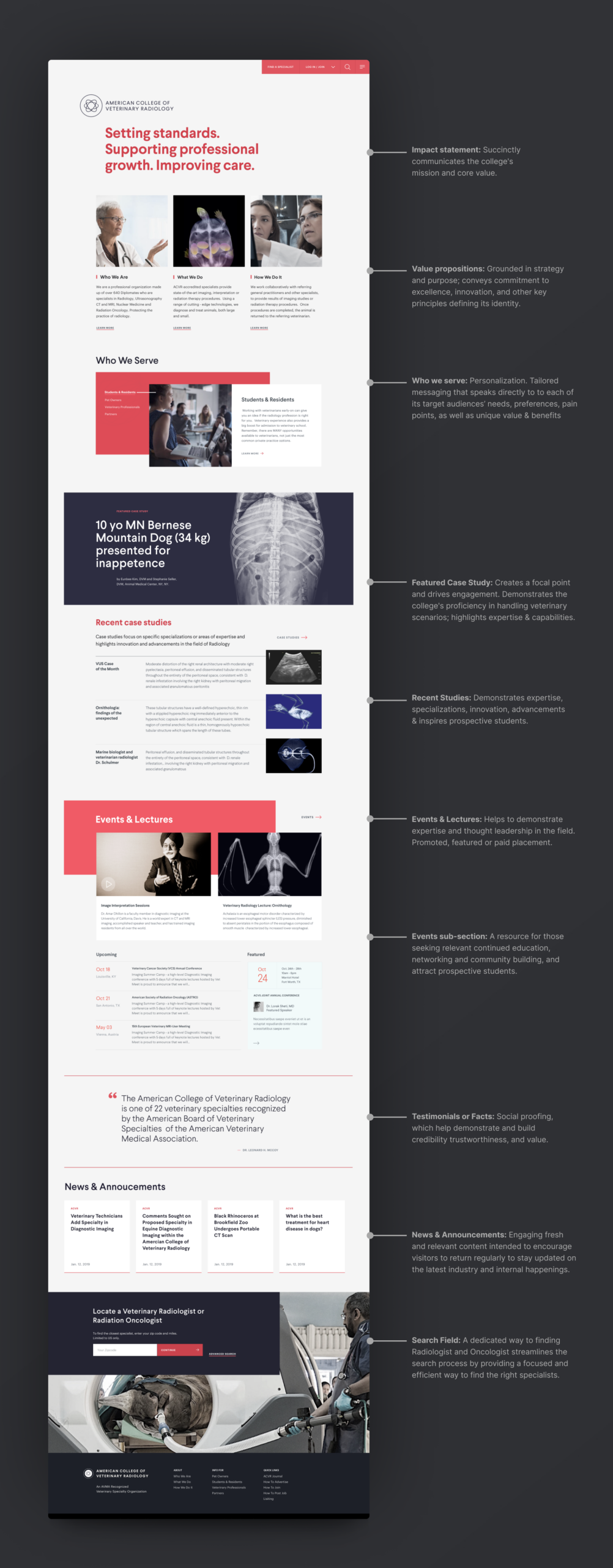
A dynamic page now surfaces research, education, and industry news through clearer organization and stronger content hierarchy. It encourages exploration while guiding visitors toward deeper content across the site.
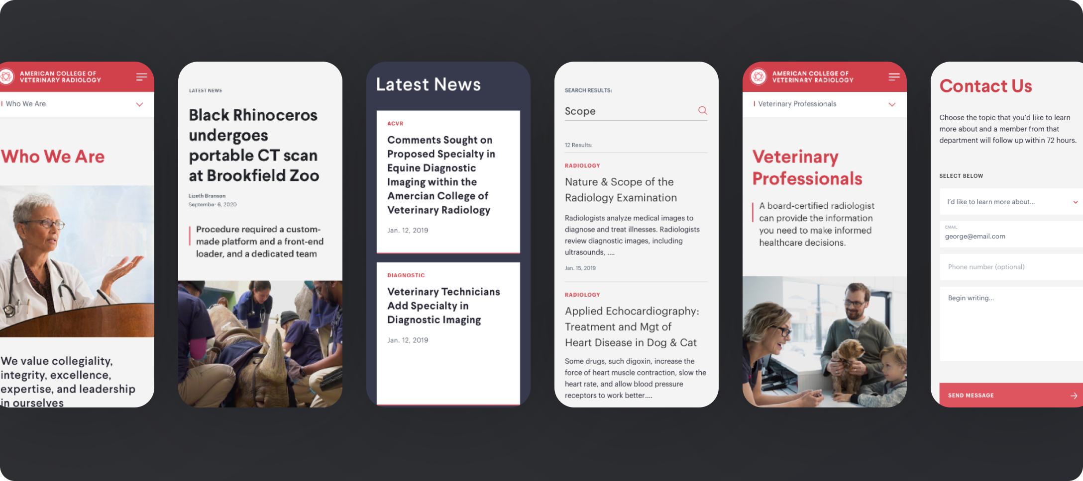
Responsive designed mobile-first. While 65% of traffic was desktop, starting with mobile clarified content hierarchy and improved navigation across devices.
Who ACVR serves
Four distinct groups interact with the experience, each with different needs and different levels of familiarity with the organization. Understanding that shaped both the content strategy and the design approach. Resources like case studies, lectures, seminars, and a calendar of events serve most, at different points in their journey.

Veterinary Students: Early-career, exploring the specialty, figuring out if radiology is their path. Needs: Approachable content, clear pathways, and resources that support learning.

Diplomates and Members: Board-certified specialists with no time to waste. Needs: Fast, efficient access to CE, certification tools, research, and industry news.

Non-Member Professionals: GPs, technicians, and residents working alongside radiologists. Needs: Relevant content that keeps them engaged and a clear path to membership.

Pet Owners and Referring Organizations: Pet owners, Zoos, specialty practices, navigating a diagnosis. Needs: Confidence they've found the right specialist. Clear credentials, plain language, easy directory access.
Designing structure & pathways
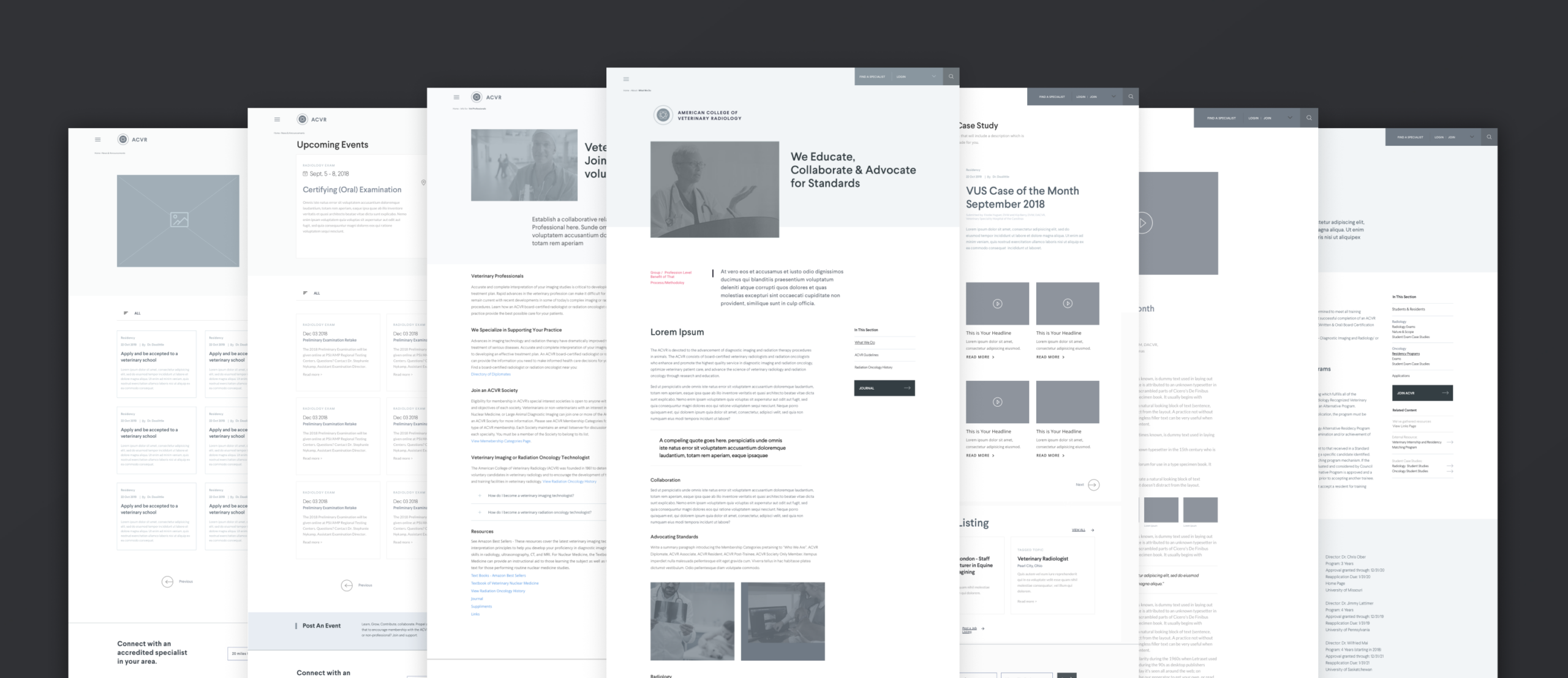
The Public facing experience focused on making complex, specialized information easier to navigate while reinforcing trust and credibility. Clear hierarchy and pathing help users quickly find what they need and explore deeper content when relevant.
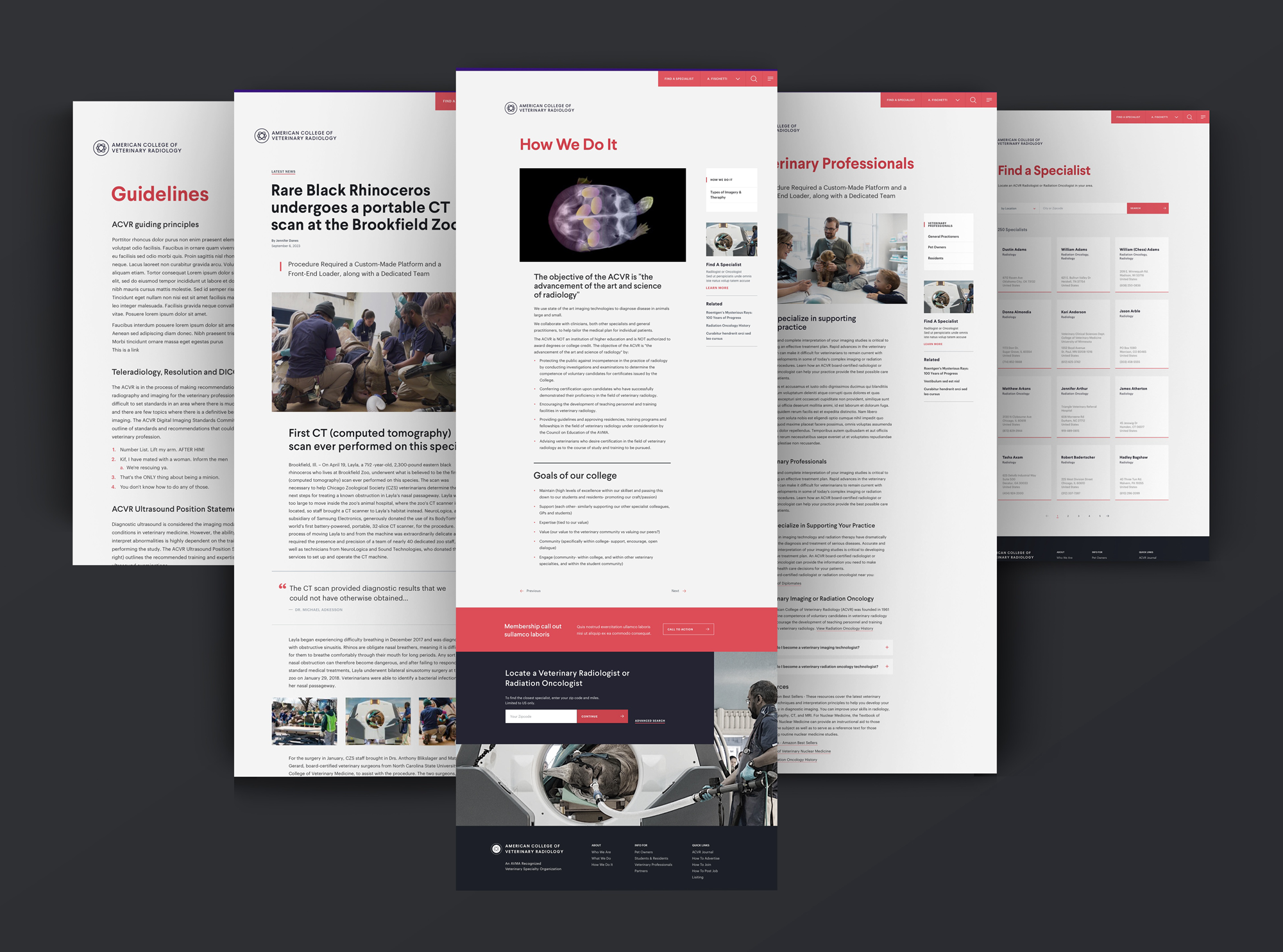
On Tier 2 pages, Section-Level navigation in the right rail guided visitors through nested content within each vertical. Contextual links guided users to related resources and support intuitive movement across topics. The result is a cohesive, scalable structure that positions ACVR as a reliable source for education, research, and industry insight.
Storytelling, systematized
The landing page was designed as a storytelling experience, guiding users through layered content in a deliberate sequence as they scroll. Content hierarchy shaped pacing, emphasis, and flow — progressively revealing ACVR’s thought leadership and value as a professional resource.
The page evolved into a resource hub, with timely and valuable content driving return visits — up nearly 300%. The content was organized into evergreen, curated, and aggregated. The result was a structured experience that reduced redundancy, clarified priorities, and made complex information easier to navigate.
Exploration and learning made easier
I designed the interior pages to extend the landing experience into a scalable system for research, case studies, and educational content. I focused on making dense information scannable and easy to navigate, using right-rail local-navigation for context and related links at the bottom of content blocks to guide exploration.
Off-white and light gray backgrounds were selected to reduce eye fatigue, shorter paragraph widths and modular page structures keep the system consistent and flexible. The result is a set of pages that supports learning and discovery across the platform,
Hey there, this is the default text for a new paragraph. Feel free to edit this paragraph by clicking on the yellow edit icon.
Authenticated member experince
Based on my research sessions, radiologists spend significant time in low-light environments, which called for designing with a dark UI theme. The modular, tile-based layout surfaces content based on where a member is in their career journey. The content strategy centers on evergreen, curated, and aggregated content alongside educational resources, research materials, and industry news.
Students see resources that support their learning path. Working professionals get continuing education, research, and certification tools. Questionnaires provide a meaningful way to capture member opinions and feedback.
The left rail handles navigation, user settings, quick links to relevant content, and tracking for required career tasks — including professional development tools that support day-to-day workflows.
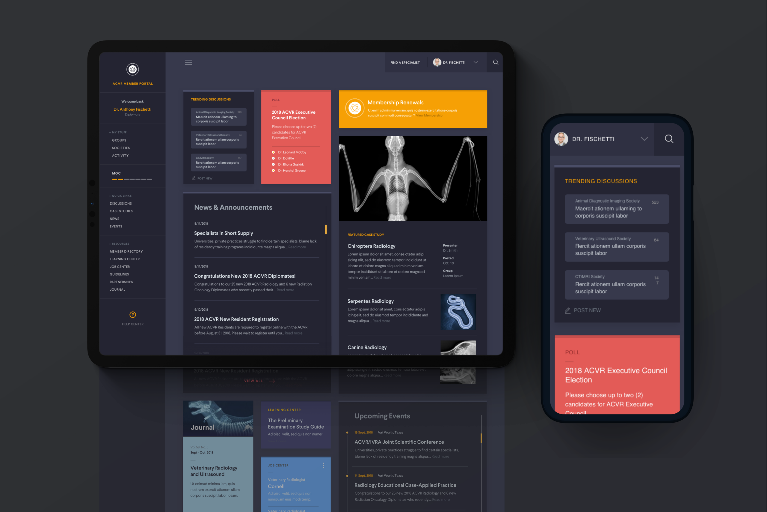
Responsive dashboard with modular tiles for certification tracking, education resources, research, news, and member questionnaires.
Conclusion
This was a fast-paced project. Even with a limited timeframe and budget, I focused on delivering a strong design and user experience. It was important to listen, capture feedback and refine. Step and repeat.
The digital strategy does more than explain ACVR’s benefits as a college — it serves the profession through organized, evergreen, curated, and aggregated content used across all levels of the industry.
The content strategy reinforces ACVR as a thought leader and valued resource, while long-form scrolling supports both quick reference and deeper reading, with improved discoverability through clearer navigation and pathing.
The result is a platform that provides lasting value to both the College and the profession it serves.
Sands Capital
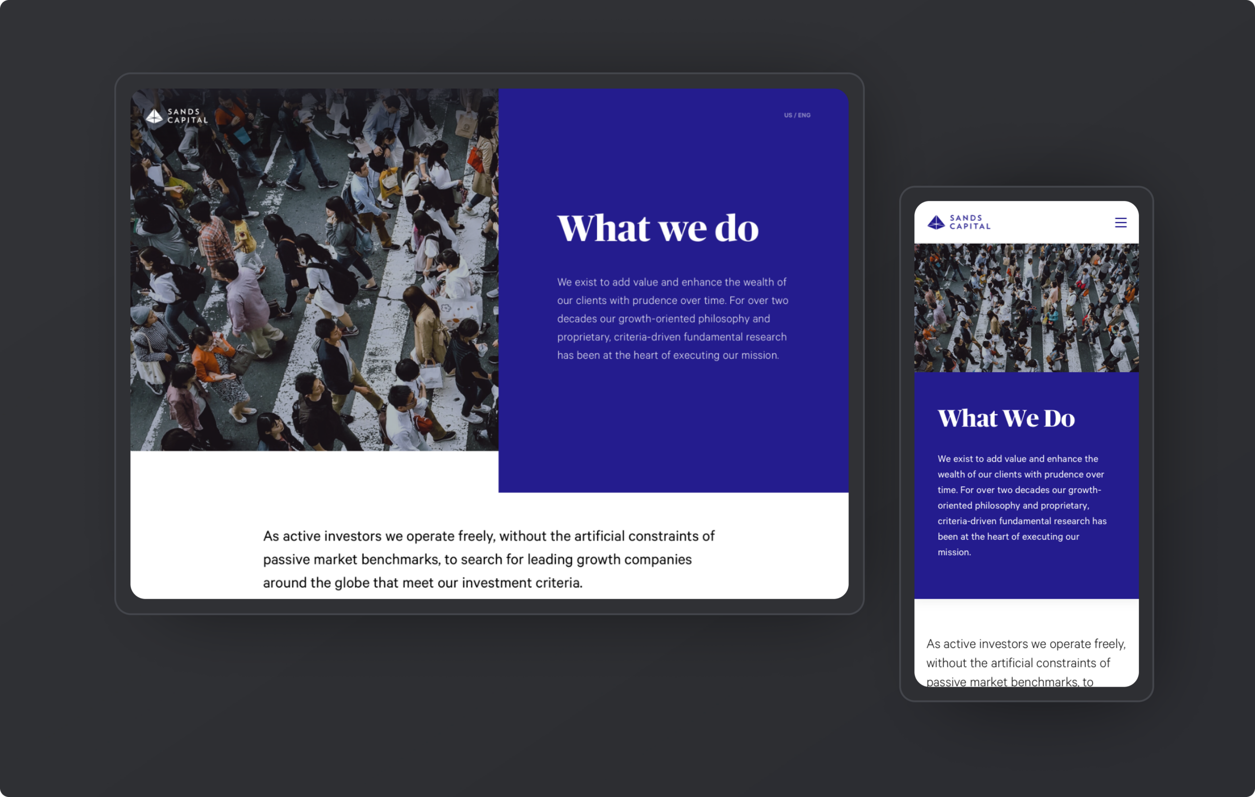
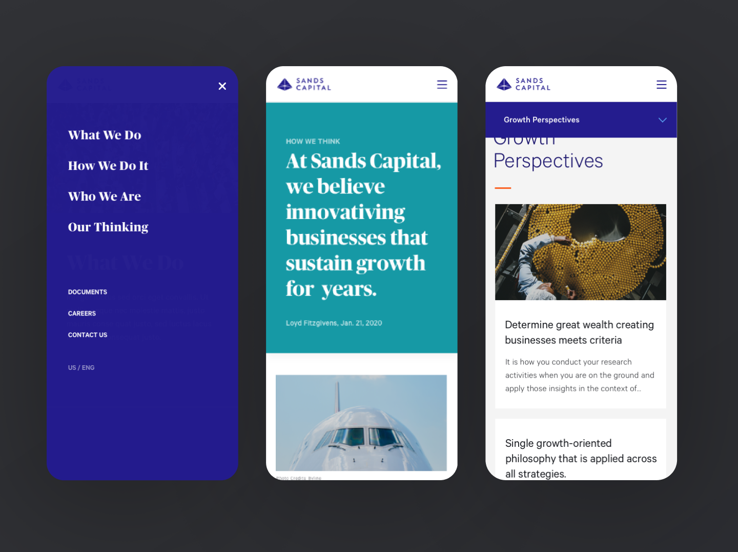
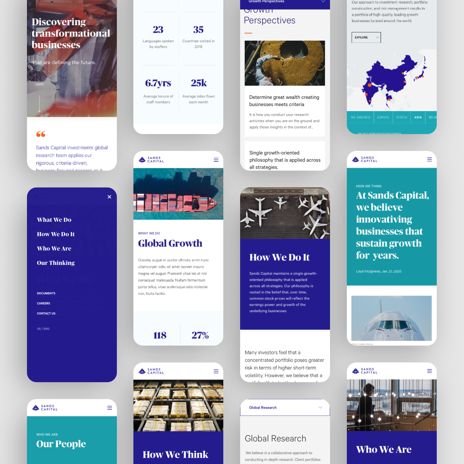
This rebrand project focused on shaping the digital expression of a global investment firm's new brand, creating a clearer and more engaging way for site visitors to explore the firm's thinking.
Contribution
My work centered on translating the new visual language into digital. I defined page styles, UI patterns, and the foundational design system, shaping content hierarchy and interaction behaviors that could scale.
I partnered closely with brand, content, and engineering teams to ensure the experience felt cohesive, intuitive, and aligned with the brand direction.
Challenge
The website needed to evolve alongside the firm's business goals and stand out in a competitive market with a stronger, more modern presence.
As the firm expanded its offerings, the experience needed to support growth while more clearly communicating its value proposition and differentiation.
At the same time, the content infrastructure needed to scale. A CMS was required to support greater flexibility in storytelling without sacrificing consistency or clarity.
Approach
We worked closely with the client to align on goals and conducted a thorough audit of the existing website. This included analysis of the target audience, user research, and stakeholder interviews to inform the design process.
We focused on creating a clean, intuitive user experience with a simplified site structure that made it easy for users to find what they needed.
The foundation for a Design System was created to support the scalable custom CMS.
Design direction
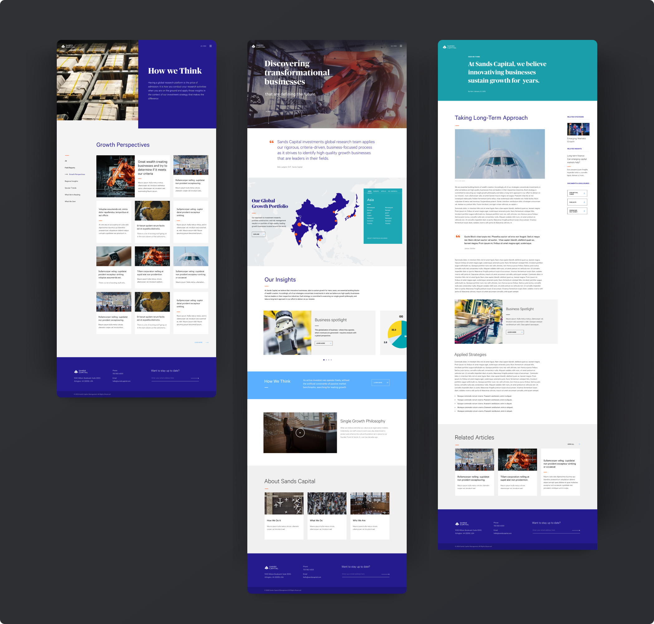
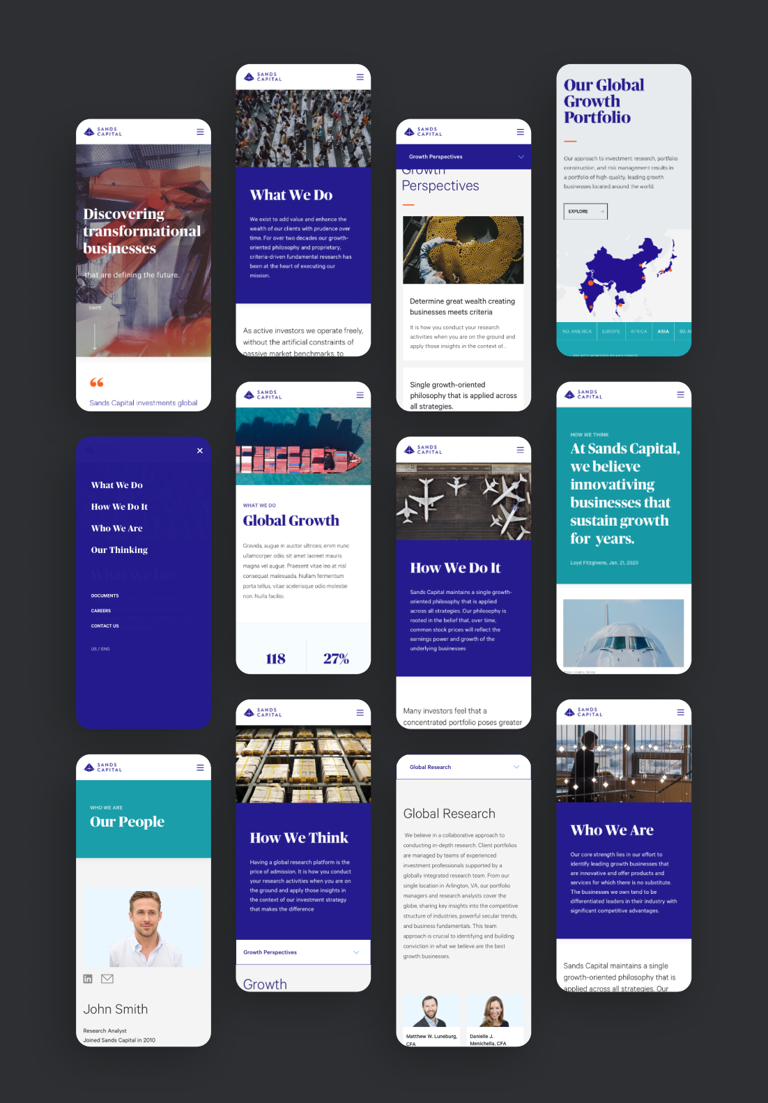
My role was translating the brand language into a functional digital experience. I applied the visual system to page layouts, defined how typography scaled across devices, and ensured the color palette worked for accessibility and across UI patterns. Generous whitespace became a tool for creating focus and guiding users through content while maintaining visual cohesion.
Interaction patterns were defined to balance sophistication with accessibility. Navigation was streamlined, content hierarchy was clear, and UI elements were designed to guide users naturally through the thinking and offerings.
The visual system was built for flexibility, allowing for diverse storytelling across different offerings while maintaining a consistent, recognizable digital expression that felt true to the brand's direction.
Workplace
Creating clarity in complexity. Designing security and compliance experiences for a SaaS platform in highly regulated industries, helping admins oversee hundreds of devices while keeping employees secure, compliant, and productive.
Secure, compliant, and productive.
Overview. Designing for a security and compliance platform means balancing control with clarity and ease of use. Admins need to oversee hundreds of devices in real time, tracking compliance metrics, identifying vulnerabilities, and enforcing policies, while employees need to understand their security status and know what actions to take.
The challenge was designing an admin dashboard experience to make complex security data scannable, actionable, and easy to act on, while creating a work environment that allowed for productivity without feeling restrictive.
Designing for real-time compliance
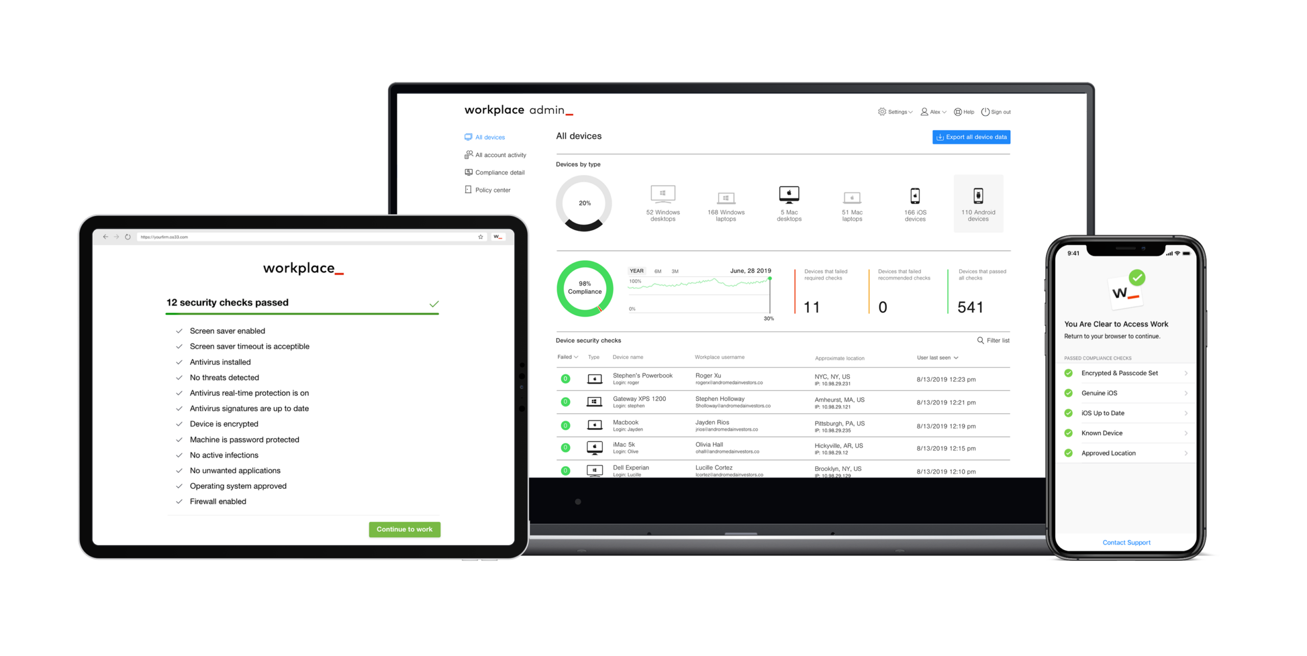
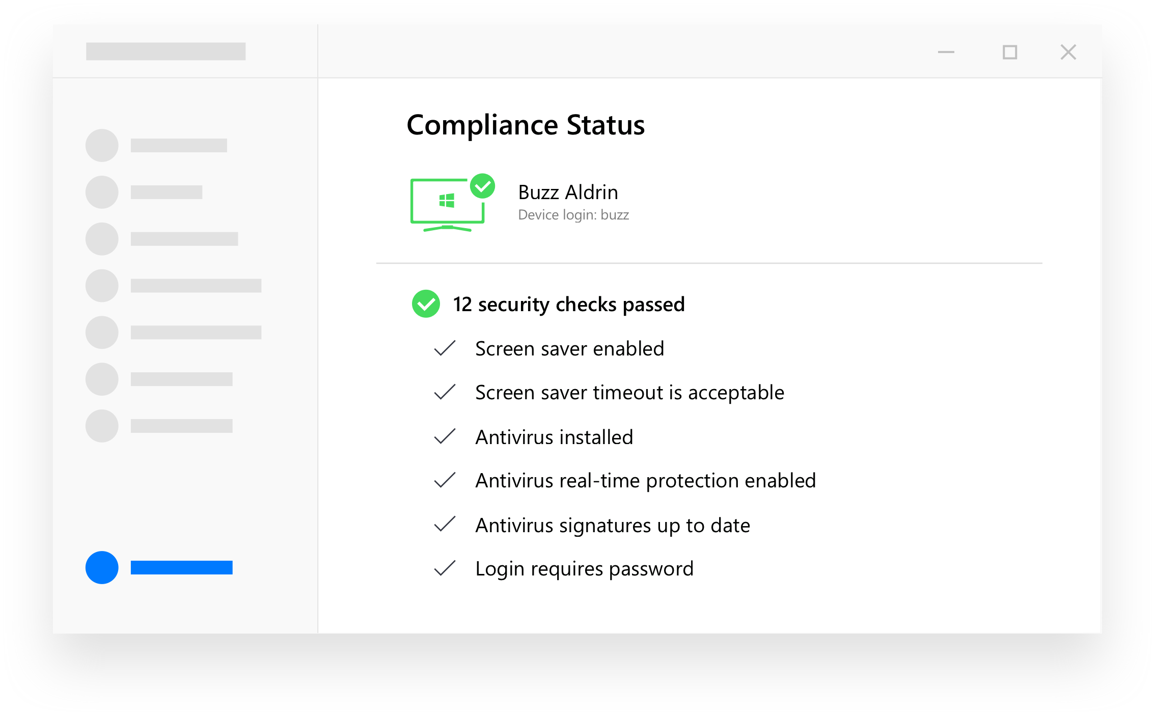
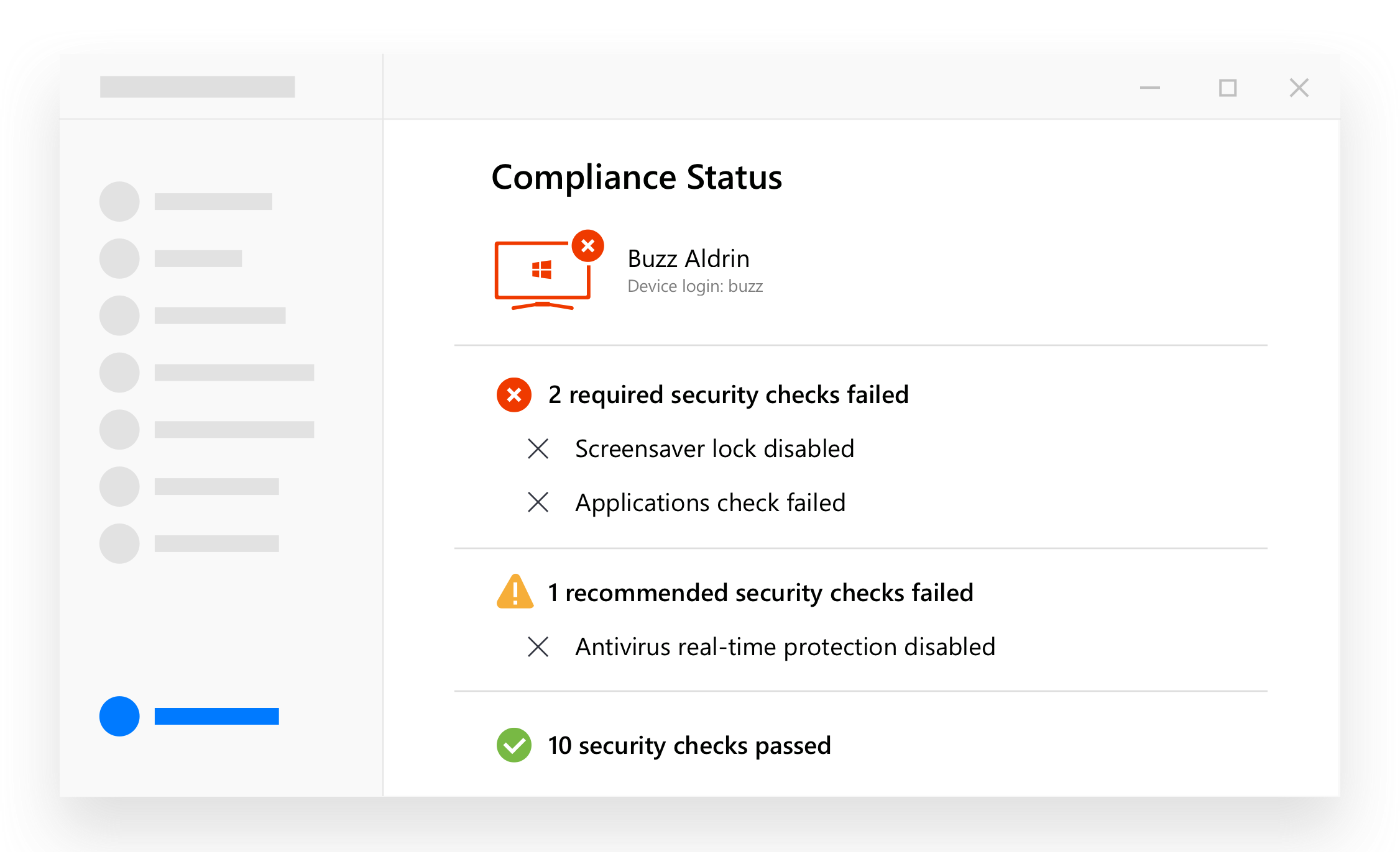
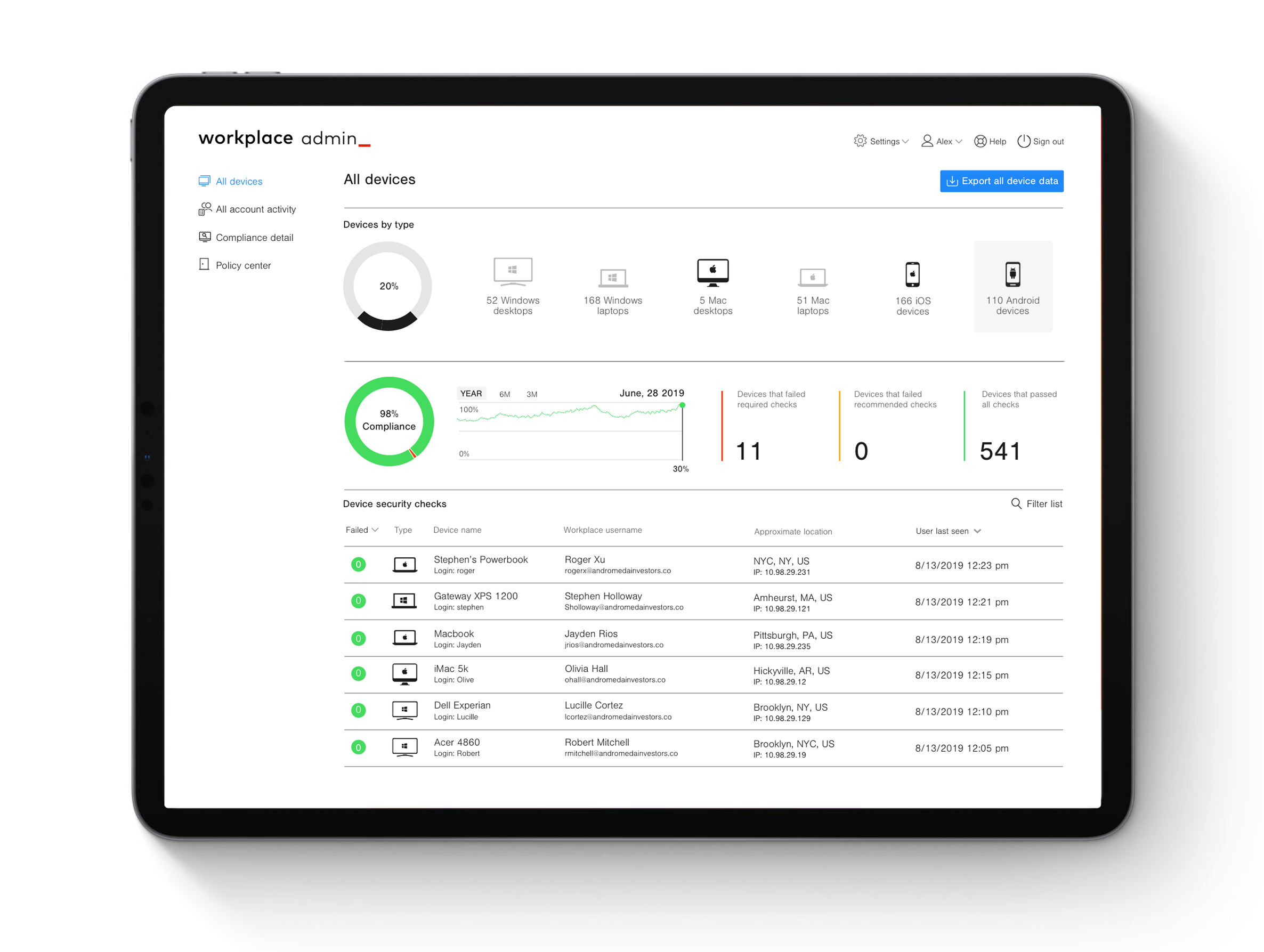
The dashboard was designed to make complex security data instantly understandable for both admins and employees. Generous white space creates clear areas of focus. A donut chart highlights current compliance status, with large-format numbers breaking down pass/fail metrics. A filterable table surfaces devices by check type—failed, recommended, or passed—giving immediate visibility into what needs attention.
The design prioritizes scannability and decision support. Visual indicators, color-coded status badges, and hierarchical information architecture allow users to assess the situation at a glance, then drill into details only when needed.
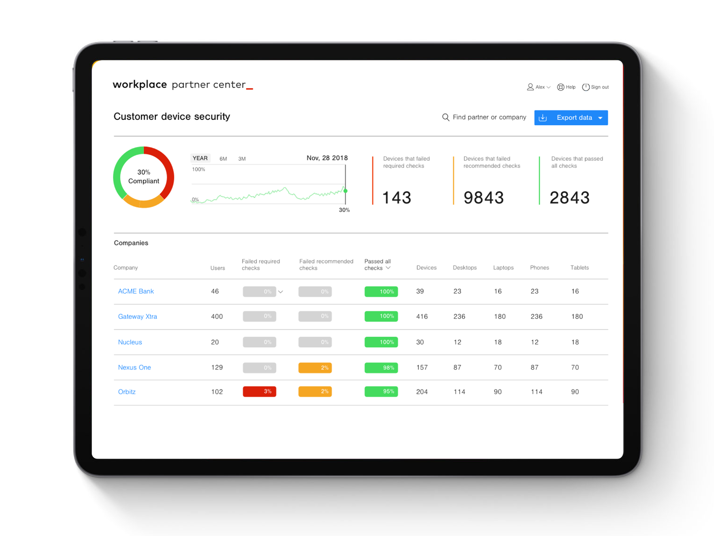
Organizational View: Top-level dashboard showing organizational compliance across business units and partnerships. Status indicators and device counts let admins quickly identify which areas need attention.
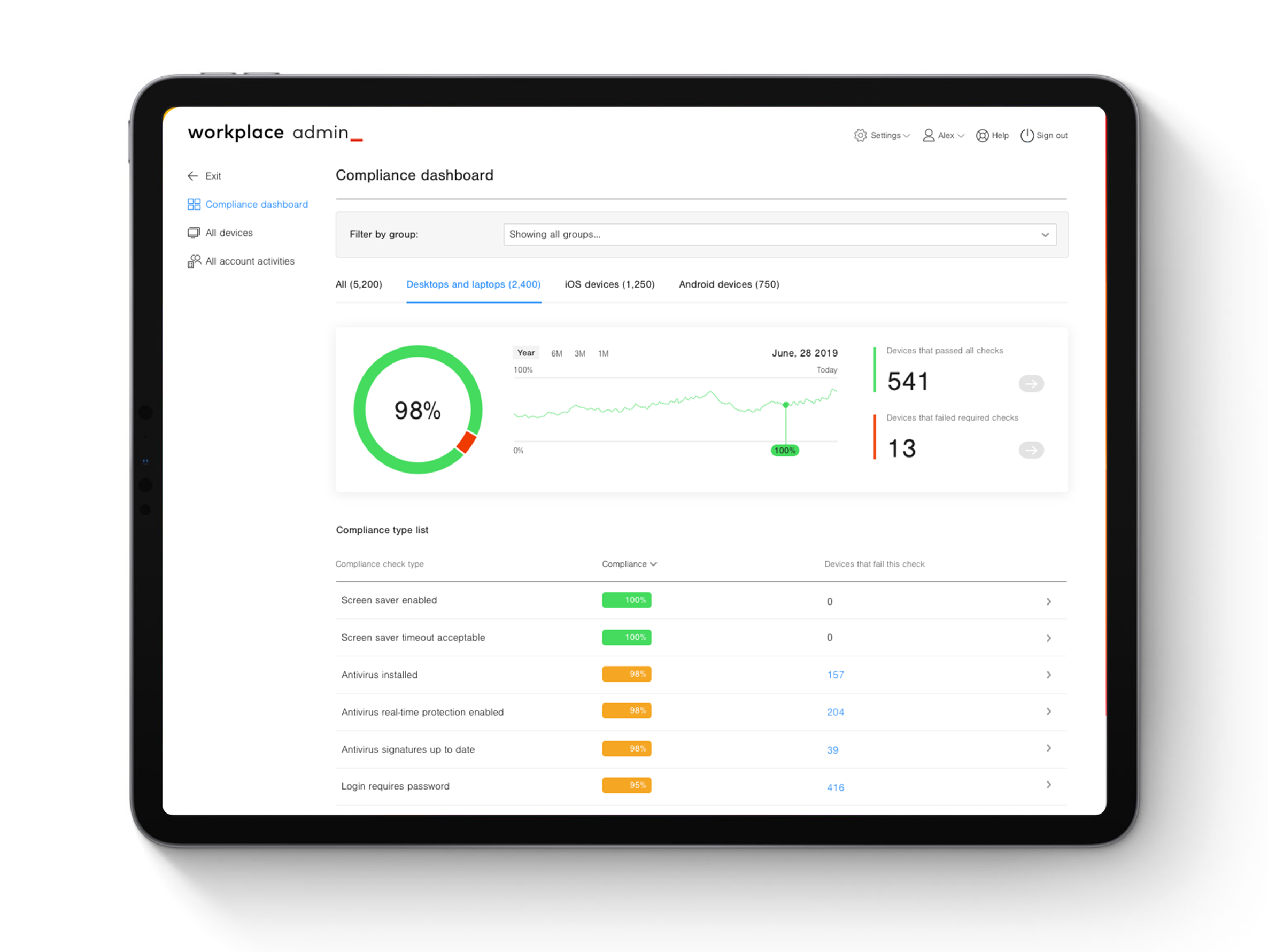
Compliance Overview: Displaying compliance check types, ratings, and device breakdowns. Large-format numbers, color-coded status indicators, number and type of devices that failed required checks, passed recommended checks, or achieved 100% compliance.
Employee view: Employee-level dashboard showing individual compliance status and actionable recommendations. Visual indicators and prioritized actions guide next steps to achieve compliance.
Filtering
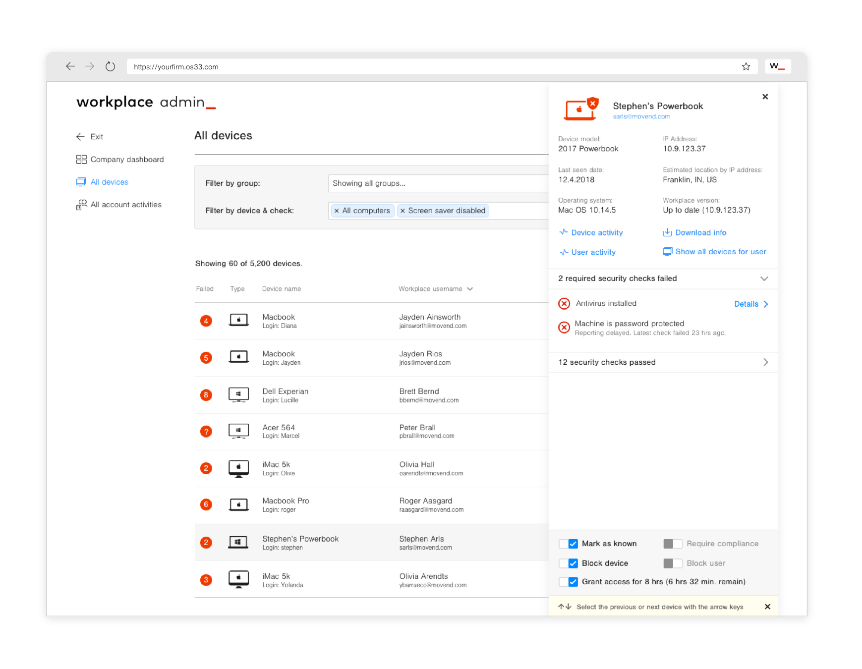
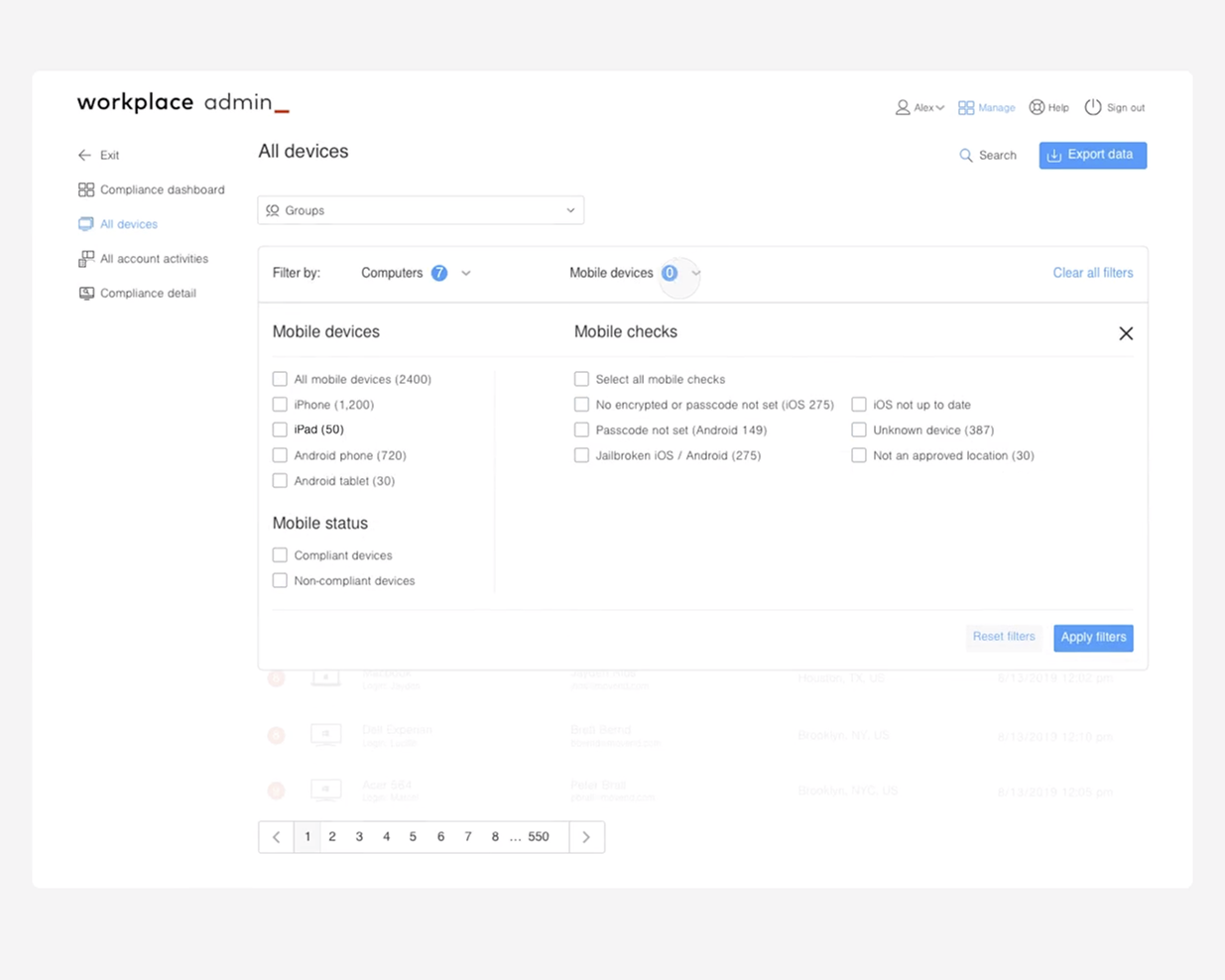
The device filtration system needed to surface the right information at the right time so admins could quickly identify issues and drive toward 100% compliance. This required designing for two distinct mental models: employees monitoring their own devices, and admins managing an entire fleet.
Designing for productivity
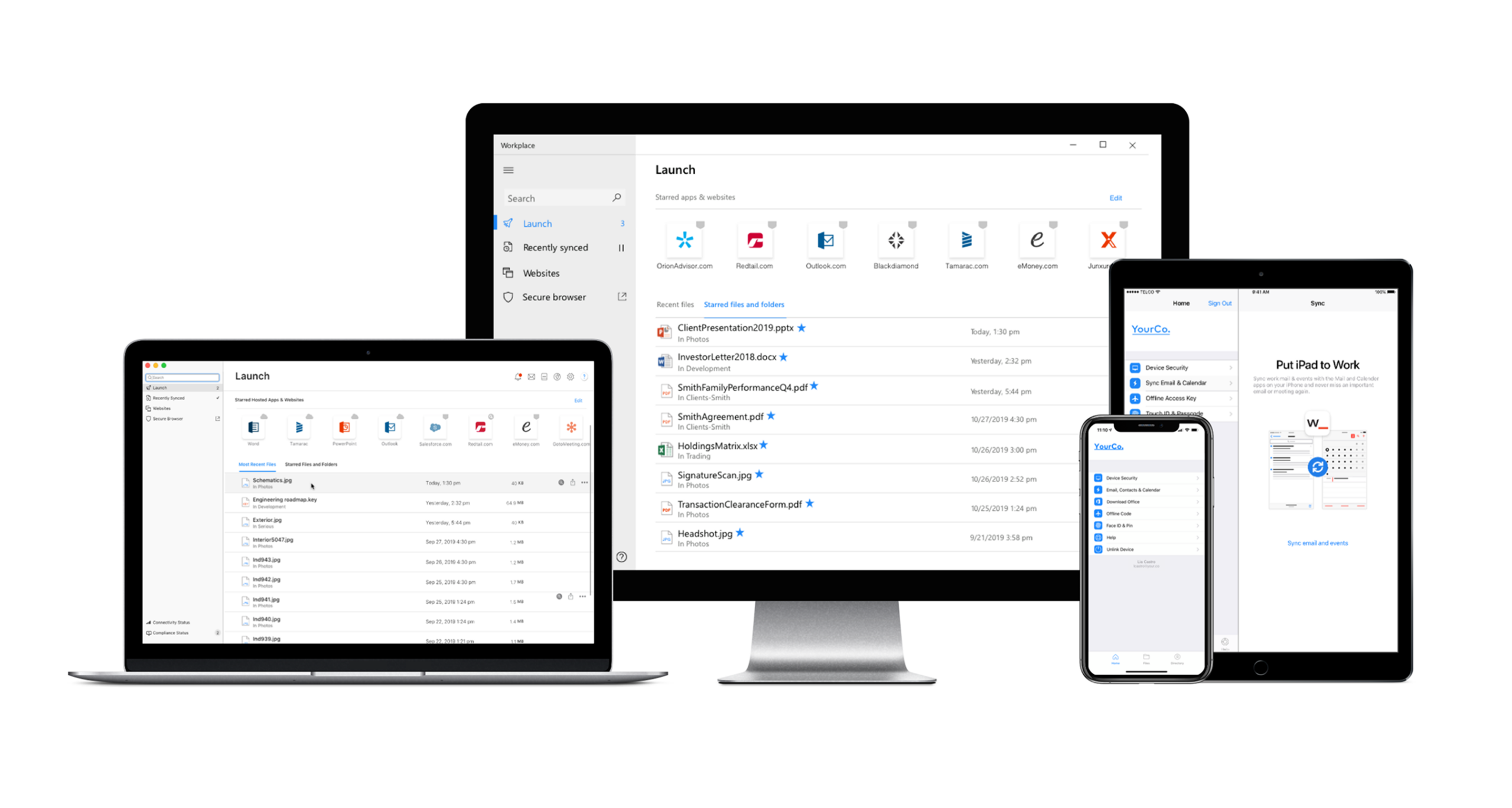
Employees needed to work securely without feeling slowed down or restricted. We listened to feedback captured through in-app surveys and customer service calls, synthesizing insights to inform enhancements where feasible.
Although regulated environments have inherent restrictions, the experience was designed to feel enabling, not limiting. Employees have immediate access to their apps and files, with the ability to customize workflows to match how they actually work. Security runs in the background—visible when needed, invisible when not.
Simplifying a digital intake experience
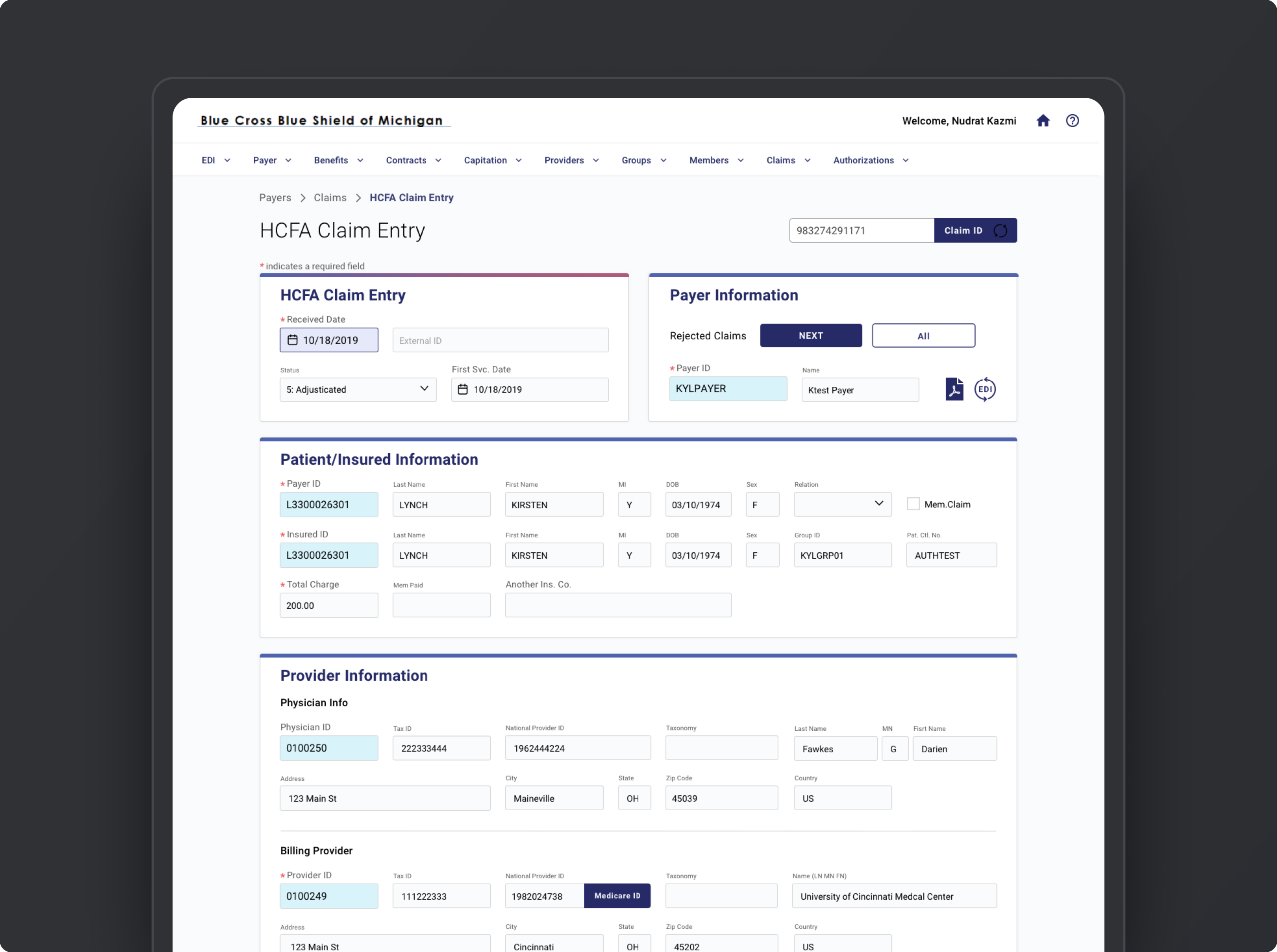
I was Experience Design Lead for a redesign of a digital intake interface for a health insurance provider. The administrative workflow was difficult and not very intuitive for the teams using it, creating a steep learning curve, especially when onboarding new staff.
The goal was to simplify the data entry experience while designing around existing tech and backend constraints. We made meaningful usability improvements without rebuilding from the experience scratch.
Starting with the process
We started by understanding how admins actually entered and processed information. A heuristic review and user feedback helped identify where the experience was difficult to learn and use, while tech constraints defined what changes were even possible.
Information was reorganized into logical groupings, input fields were standardized, and hierarchy strengthened so users could quickly see what information was required and where to enter it. Clear labels, consistent field patterns, and improved feedback — informational, error and success states — help guide users through the process and reduce friction during data entry.
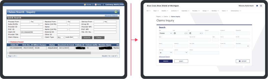
Bringing clarity to data entry
Administrators were quick to appreciate the thoughtful redesign. Grouping related information, strengthening hierarchy, and refining form patterns made the interface easier to scan and complete.
Good design = happy users. The result reduced cognitive load and allowed staff to focus less on navigating the system and more on the work itself.
Selected Works
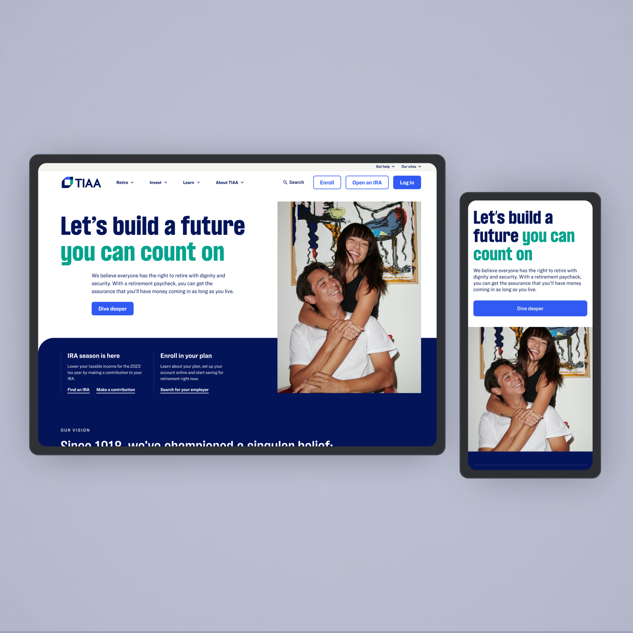
Digital RebrandExperience Design and Strategy
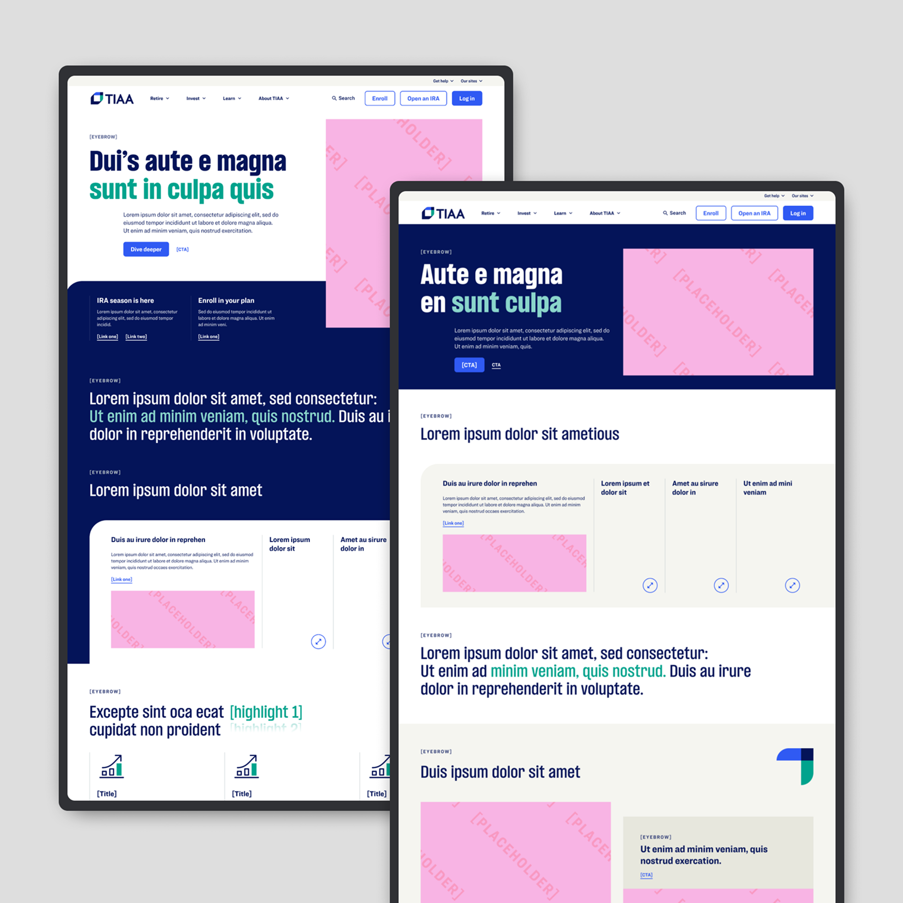
Marketing Design SystemSystem Design
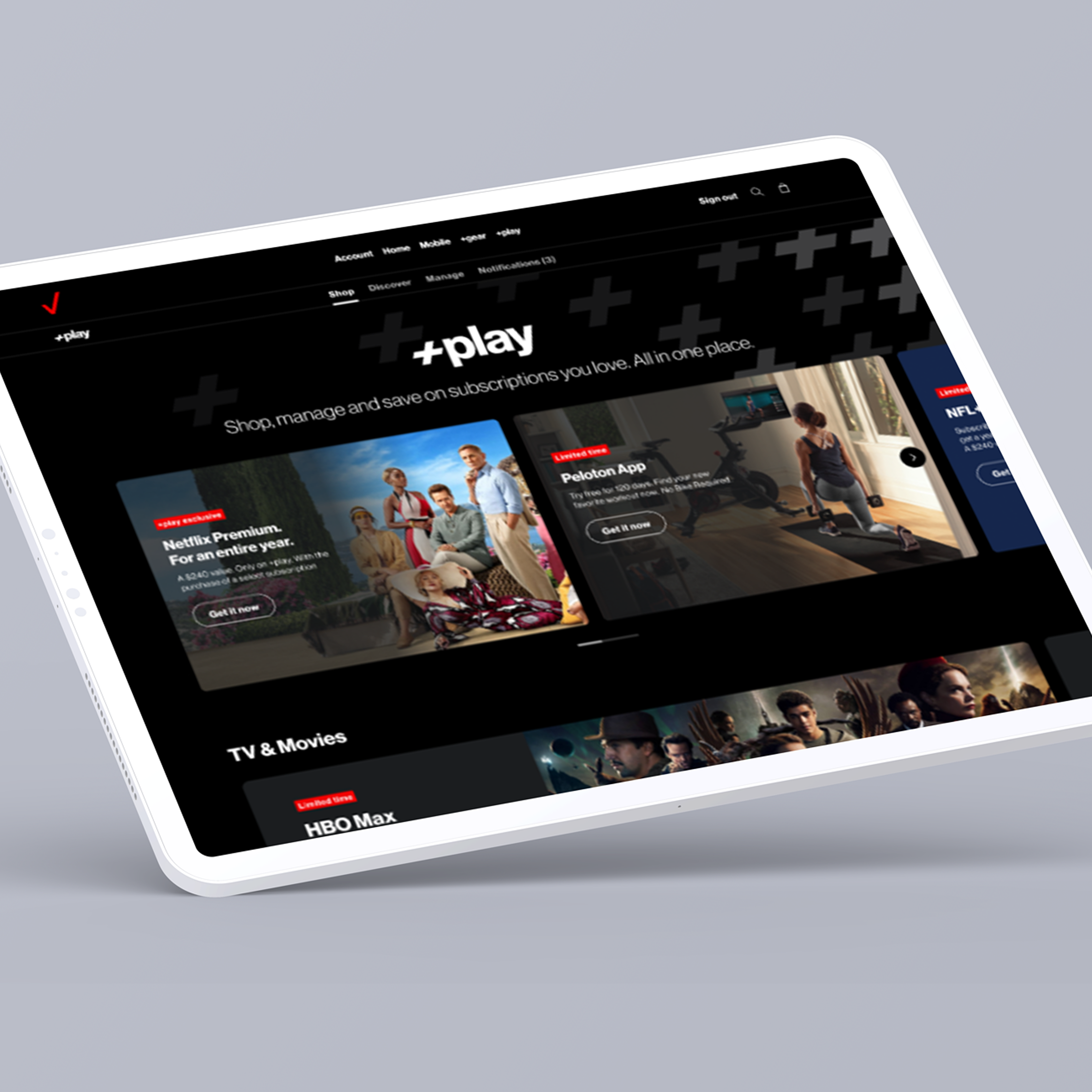
VZ +playUI, UX, Digital Strategy
Past ProjectsUI, UX, Digital Strategy
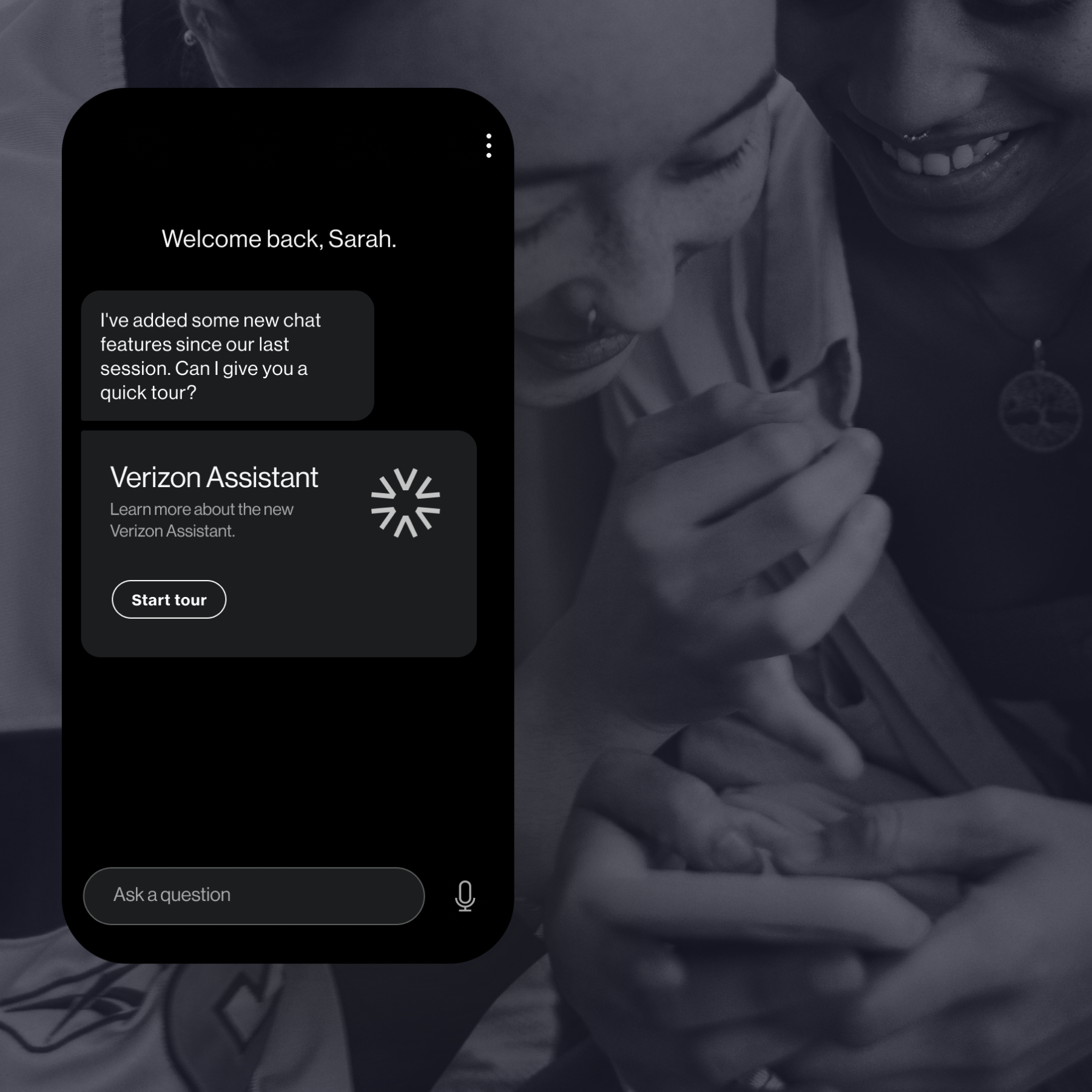
Conversational DesignProject type
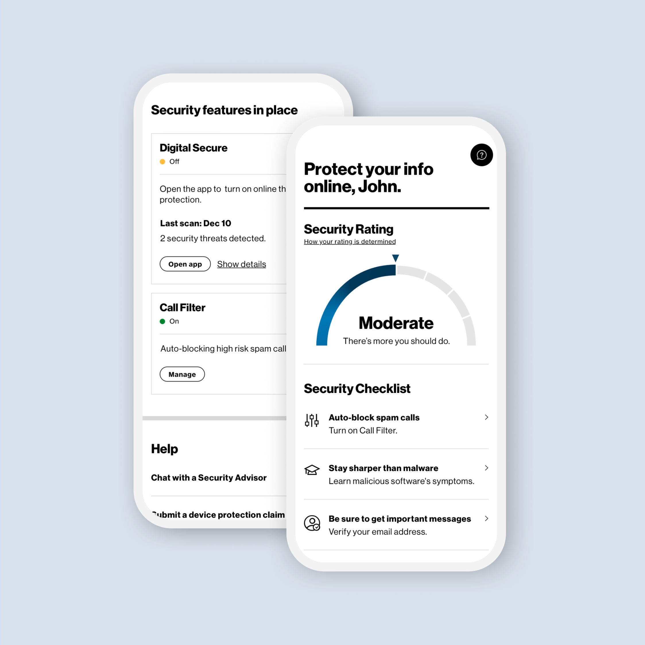
Select ProjectsProject type